Renaissance Oil vs. Watercolor Pet Portrait: Which Style Suits Your Pet?
Renaissance oils feel timeless and regal; watercolors feel light and intimate. Here’s how to choose based on your pet’s coat, your home, and the story you want to tell.
Choose Renaissance oil if you want a dignified, museum-like portrait that flatters dark coats and formal rooms. Choose watercolor if you want a gentle, airy image that suits light-coated pets and bright, casual spaces. Preview both from the same phone photo to see which one feels more like your pet.
Choosing a pet portrait style can feel like deciding between two very different memories of your pet. A Renaissance oil painting turns your dog or cat into a regal figure from a museum wall, while a watercolor portrait feels more like a loose, loving sketch done in soft morning light. Both can be beautiful, but they are not interchangeable. The right choice depends on your pet’s colors, your home, and the feeling you want to preserve.
The Mood of Each Style
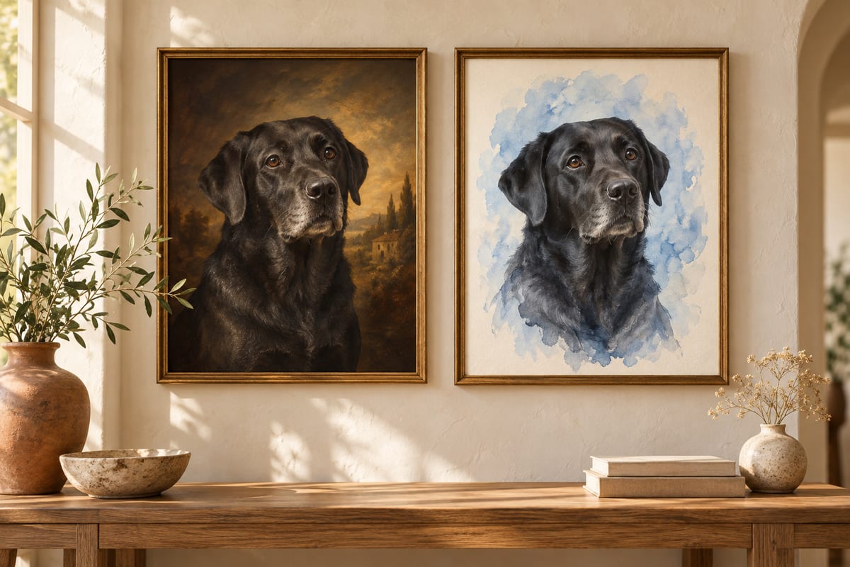
Renaissance oil portraits borrow from 15th- and 16th-century painting traditions. They usually use deep browns, warm golds, and rich reds, with dramatic lighting that gives the subject weight and presence. A pet painted this way looks dignified, almost royal. It is a formal portrait in the same tradition as a family heirloom. The eye goes to the face, and the background often fades into shadow, focusing all attention on your pet’s expression.
Watercolor is the opposite in almost every way. It is translucent, light, and a little unpredictable. Instead of building up layers of thick paint, watercolor lets the paper show through, so the final portrait often feels airy and delicate. It tends to capture personality through gesture and color rather than perfect detail. A watercolor pet portrait feels like a memory you caught while your pet was doing something ordinary and sweet.
Which Coats and Breeds Look Best?
Because Renaissance oil relies on strong contrasts between light and shadow, it does wonders for pets with dark, rich fur. Black Labradors, Rottweilers, tuxedo cats, and deep brown retrievers gain a new kind of depth when painted in oils. The warm highlights bring out the texture of the coat, and the dark background makes the animal’s face seem to glow. Pets with strong, noble features and steady expressions also fit this style well.
Watercolor prefers light and color. White and cream pets, golden retrievers, Siamese cats, tortoiseshell cats, and pets with soft pastel or diluted coloring look especially natural in watercolor. The style can also capture multicolored or spotted coats beautifully because the transparent layers allow the colors to blend without becoming muddy. If your pet has very fine fur or a light background coat, watercolor keeps the portrait airy instead of heavy.
What About Your Room and Lighting?
A Renaissance oil portrait is a statement piece, but it needs the right setting. It looks best against deep wall colors, dark wood furniture, brass or gold frames, and rooms with warm, low lighting. In a modern white apartment with minimalist decor, a heavy oil portrait can feel out of place. That doesn’t mean it won’t work, only that it will dominate the room and set a formal tone.
A watercolor portrait blends into bright and casual spaces. It suits white or pale gray walls, natural wood, linen textures, and rooms filled with daylight. Because watercolor has a lot of white space, it feels lighter and less imposing. This makes it a good choice for a bedroom, a reading nook, or a hallway where you want a soft accent rather than a focal point.
Tradition and Cost in Real Terms
Historically, oil painting was the medium of royalty, nobility, and religious altarpieces. That long tradition gives Renaissance-style portraits a sense of permanence and importance. Watercolor has its own tradition, but it is tied more to botanical illustration, travel sketches, and intimate personal albums. Neither is better; they just carry different associations. If you want your pet to look like part of a grand family lineage, oil is the obvious choice. If you want an heirloom that feels personal and immediate, watercolor is often more approachable.
Cost is a separate question. Traditional custom portraits by human artists can vary widely depending on the artist’s fame, canvas size, and time required. Renaissance-style oil paintings usually take longer because of the layering and glazing involved, while watercolors are often seen as less expensive to commission. But with a digital portrait service, you are not locked into those old pricing structures. You can preview both styles from the same photo and then choose the finished look that fits your budget and taste, without guessing.
Memorial or Celebration?
Think about the occasion. Renaissance oil has a natural connection to memorials and legacy. Because the style is formal and slightly solemn, it can give a pet’s absence a sense of dignity. A portrait of a pet who has passed away feels more like a monument when rendered in oil. It says, This life mattered. It is also a powerful way to honor a senior pet while they are still with you.
Watercolor is better for celebrating a living, playful spirit. It captures lightness, charm, and movement. If the portrait is meant to mark a fun memory, a puppy’s first year, a cat’s favorite sunbeam spot, or a road trip companion, watercolor keeps the mood joyful. That doesn’t mean it can’t be sentimental. It just expresses sentiment through softness rather than grandeur.
A Simple Decision Framework
Ask yourself these questions:
- Do I want the portrait to feel like a royal court painting, or like a favorite afternoon memory?
- Does my pet have dark, rich fur that would benefit from dramatic light, or light fur and soft markings that would look better in translucent washes?
- Is the portrait going in a formal, dimly lit room or a bright, casual space?
- Am I honoring a legacy, or celebrating a life that is still unfolding?
Answering “the first option” to most of these favors Renaissance oil. If you lean toward the second answers, watercolor is probably a better fit.
Preview Both Before You Choose
Instead of trying to imagine your pet in two completely different art styles, use the same clear, well-lit phone photo at petmona.app/generate. Generate the Renaissance oil preview first, then select watercolor and generate a second preview. Keeping the reference photo consistent makes the two finished results easier to compare.
Once you decide, you can order a physical version at petmona.app/framed-print. PetMona's wall-ready option is a 12×16-inch archival matte fine-art print mounted in a black oak frame behind shatter-resistant acrylic. Start with the previews, choose the result you prefer, and then decide whether the framed format suits your room.
PetMona turns a clear pet photo into wall-ready art — ship an 8×10″ print or unlock HD to gift yourself. Free preview, no subscription.
Frequently asked questions
Can I really see my pet in both styles before choosing?
Yes. Upload one clear phone photo, generate a Renaissance oil preview, then select watercolor and generate that preview separately from the same image. You can compare the two results before deciding which one you prefer.
Which style is better for a black or dark-colored pet?
Renaissance oil is usually the stronger choice because it uses strong highlights and deep shadows to bring out facial features and fur texture in dark coats. Watercolor can make very dark pets look flat unless the artist adds enough contrast. Preview your own photo to confirm.
Will either style look good as a framed print?
Both can. Renaissance oil prints look best with a classic frame and a smooth or slightly textured paper, while watercolor prints look great in a light frame with a white mat. If you want to be sure, order a framed print and check it in your room.